Section 3.5: The Five-Number Summary and Boxplots
Objectives
By the end of this lesson, you will be able to...
- compute the five-number summary
- draw and interpret boxplots
For a quick overview of this section, watch this short video summary:
The Five-Number Summary
The five-number summary of a set of data consists of the smallest data value, Q1, the median, Q3, and the largest value of the data.
Example 1
To illustrate, let's again look at those exam scores from Example 4 in Section 3.4.
| 48 |
57 | 58 | 65 | 68 | 69 | 71 | 73 | 73 |
| 74 | 75 | 77 | 78 | 78 | 78 | 79 | 80 | 85 |
| 87 | 88 | 89 | 89 | 89 | 95 | 96 | 97 | 99 |
Find the five-number summary.
From Example 4 in Section 3.4, we already know that Q1 = 71, median 78, and Q3 = 89. We only need the maximum and minimum, so the five-number summary is:
minimum = 48
Q1 = 71
median 78
Q3 = 89
maximum = 99
Boxplots
Using the five-number summary and the fences, we can create a new graph called a boxplot.
Drawing a Boxplot
- Step 1: Determine the five-number summary and the lower and upper fences.
- Step 2: Draw a horizontal line and label it with an appropriate scale.
- Step 3: Draw vertical lines at Q1 , M, and Q3. Enclose these vertical lines in a box.
- Step 4: Draw a line from Q1 to the smallest data value that is within the lower fence. Similarly, draw a line from Q3 to the largest value that is within the upper fence.
- Step 5: Any values outside the fences are outliers and are marked with an asterisk (*).
A typical boxplot will look something like this:

Example 2
To illustrate, let's again look at those exam scores from Example 4 in Section 3.4.
| 48 |
57 | 58 | 65 | 68 | 69 | 71 | 73 | 73 |
| 74 | 75 | 77 | 78 | 78 | 78 | 79 | 80 | 85 |
| 87 | 88 | 89 | 89 | 89 | 95 | 96 | 97 | 99 |
Take a moment and try to sketch a boxplot of this data set, following the description above.
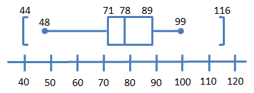
Using the five-number summary from Example 1 above and the outlier calculation from Example 5 in Section 3.4, we have the following information:
minimum = 48
Q1 = 71
median 78
Q3 = 89
maximum = 99
Lower fence = 44
Upper fence =
116
A boxplot would then look something like this:
Technology
Here's a quick overview of how to create box plots in StatCrunch.
|
Boxplots and Distribution Shape
The last thing we want to talk about in Chapter 3 is the relationship between the shape of a boxplot and the shape of the distribution.
In Section 2.2, we talked about distribution shape, showing the following four standards:
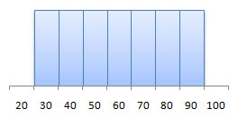 uniform |
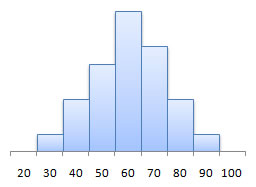 symmetric (bell-shaped) |
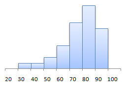 left-skewed |
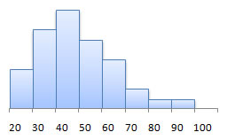 right-skewed |
Let's now see how these are related to boxplots. Here's some information from your text:
Symmetric distributions
| Distribution | Boxplot |
| Q1 is equally far from the median as Q3 is |
The median line is in the center of the box |
| The minimum is equally far from the median as the maximum is | The left whisker is equal in length to the right whisker |

Skewed left distributions
| Distribution | Boxplot |
| Q1 is further from the median as Q3 is |
The median line is to the right of center in the box |
| The minimum is further from the median as the maximum is | The left whisker is longer than the right whisker |

Skewed right distributions
| Distribution | Boxplot |
| Q1 is closer to the median than Q3 is |
The median line is to the left of center in the box |
| The minimum is closer to the median as the maximum is | The left whisker is shorter than the right whisker |

Source: Instructor Resources; Statistics: Informed Decisions Using Data
Author: Michael Sullivan III
© 2007, All right reserved.
