Section 4.1: Scatter Diagrams and Correlation
Objectives
By the end of this lesson, you will be able to...
- draw and interpret scatter diagrams
- describe the properties of the linear correlation coefficient (LCC)
- estimate the LCC based on a scatter diagram
- compute and interpret the LCC
- explain the difference between correlation and causation
For a quick overview of this section, watch this short video summary:
In Chapter 3, we looked at numerically summarizing data from one variable (univariate data), but newspaper articles and studies frequently describe the relationship between two variables (bivariate data). It's this second class that we'll be focusing on in Chapter 4.
There are plenty of variables which seem to be related. The links below are articles from various news sources, all discussing relationships between two variables.
Do
SAT Scores Really Predict Success?
Range of Variables Affect How SAT Correlates to College GPA
In each case, there's a response variable (GPA, newborn's health, cancer levels) whose value can be explained at least in part by a predictor variable (SAT score, proximity to highways, weight-loss pill consumption).
Remember, unless we perform a designed experiment, we can only claim an association between the predictor and response variables, not a causation.
Our goal in this chapter will be to find ways to describe relationships like the one between a student's SAT score and his/her GPA, and to describe the strength of that relationship.
First, we need a new type of graph.
Scatter Diagrams
Scatter diagrams are the easiest way to graphically represent the relationship between two quantitative variables. They're just x-y plots, with the predictor variable as the x and the response variable as the y.
Example 1
The data below are heart rates of students from a Statistics I class at ECC during the Spring semester of 2008. Students measured their heart rates (in beats per minute), then took a brisk walk and measured their heart rates again.
| before | after | before | after | before | after | ||
| 86 | 98 | 58 | 128 | 60 | 70 | ||
| 62 | 70 | 64 | 74 | 80 | 92 | ||
| 52 | 56 | 74 | 106 | 66 | 70 | ||
| 90 | 110 | 76 | 84 | 80 | 92 | ||
| 66 | 76 | 56 | 96 | 78 | 116 | ||
| 80 | 96 | 72 | 82 | 74 | 114 | ||
| 78 | 86 | 72 | 78 | 90 | 116 | ||
| 74 | 84 | 68 | 90 | 76 | 94 |

We can see that the heart rate before going on the walk is the predictor (x), and the heart rate after the walk is the response (y).
Here's an excellent video showing a scatter diagram on steroids created by the BBC:
Technology
Here's a quick overview of the steps for creating scatter diagrams in StatCrunch.
|
| You can also go to the video page for links to see videos in either Quicktime or iPod format. |
Types of Relationships
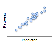
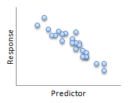
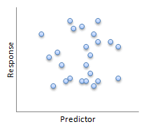
Not all relationships have to be linear, like the before/after heart rate data. The images below show some of the possibilities for the relationship (or lack thereof) between two variables.
 |
 |
| Linear | Linear |
 |
 |
| Nonlinear | No relation |
The price of a manufactured item and the profit the company gains from it, for example, do not have a linear relationship. When prices are low, sales are high, but profit is still low since very little is made from each sale. As prices increase, profits increase, but at some point, sales will start to drop, until eventually too steep of a price will drive sales down so far as to not be profitable. This might be represented by the third, "Nonlinear" image.
Positive and Negative Association
The next thing we to do is somehow quantify the strength and direction of the relationship between two variables.
Here's how we'll describe the direction:
In general, we say two linearly related variables are positively associated if an increase in one is associated with an increase in the other (first "Linear" image). We say two linearly related variables are negatively associated if an increase in one is associated with a decrease in the other (second "Linear" image).
The images below show some examples of what scatter plots might look like for two positively associated variables.
positively associated |
||
 |
 |
 |
And these are some examples of what scatter plots might look like for two negatively associated variables.
negatively associated |
||
 |
 |
 |
The Linear Correlation Coefficient
As we can see from these examples, knowing the directions isn't enough - we need to quantify the strength of the relationship as well. What we'll use to do that is a new statistic called the linear correlation coefficient. (In this class, we'll be dealing solely with linear relationships, so we usually just call it the correlation.)
The linear correlation coefficient is a measure of the strength of the linear relationship between two variables.
![]()
| where | sx is the sample standard deviation of the predictor variable sy is the sample standard deviation of the response variable n is the sample size |
I know that's quite a mouthful, but we'll be using technology to calculate it. Here's a quick summary of some of the properties of the linear correlation coefficient, as described in your text.
Properties of the Linear Correlation Coefficient
- The linear correlation coefficient is always between -1 and 1.
- If r = +1, there is a perfect positive linear relation between the two variables.
- If r = -1, there is a perfect negative linear relation between the two variables.
- The closer r is to +1, the stronger is the evidence of positive association between the two variables.
- The closer r is to -1, the stronger is the evidence of negative association between the two variables.
- If r is close to 0, there is little or no evidence of a linear relation between the two variables - this does not mean there is no relation, only that there is no linear relation.
Source: Statistics: Informed Decisions Using Data
Author: Michael Sullivan III
© 2007, All right reserved.
Next, I'd like you to visit two web sites that offer Java applets. These will help you interact with data to get a sense of the linear correlation coefficient.
Example 2
This first applet was created for use with another textbook, Introduction to the Practice of Statistics, by David S. Moore and George P. McCabe.
The applet is designed to allow you to add your own points and watch it calculate the linear correlation coefficient for you. (There are other capabilities as well, but we'll get to those in the next section.)
Applet: Correlation and Regression
Example 3
This second applet was designed as part of the Rossman/Chance Applet Collection at California Polytechnic State University.
This applet generates scatter plots for you and asks you to guess the correlation for each. Click on "New Sample" to start, enter your answer, and then "Enter" to see if you're correct.
Applet: Guess the Correlation
Example 4
Let's try to calculate a correlation ourselves. To make our data set a bit more manageable, let's use the before/after data from Example 1 in Section 4.1, but let's just use the first 8 as our sample.
| before | after | ||||
| 86 | 98 | 0.97865 | 0.78657 | 0.76978 | |
| 62 | 70 | -0.90036 | -0.84484 | 0.76065 | |
| 52 | 56 | -1.68327 | -1.66054 | 2.79514 | |
| 90 | 110 | 1.29181 | 1.48575 | 1.91931 | |
| 66 | 76 | -0.58719 | -0.49525 | 0.29080 | |
| 80 | 96 | 0.50890 | 0.67004 | 0.34098 | |
| 78 | 86 | 0.35231 | 0.08740 | 0.03079 | |
| 74 | 84 | 0.03915 | -0.02913 | -0.00114 | |
| 6.90632 | |||||
Using computer software, we find the following values:
![]() =
73.5
=
73.5
sx ≈ 12.77274
![]() = 84.5
= 84.5
sy ≈ 17.16308
Note: We don't want to round these values here, since they'll be used in the calculation for the correlation coefficient - only round at the very last step.
Since we have a sample size of 8, we divide the sum by 7 and get a correlation factor of 0.99. That seems fairly high, but looking at the scatter plot (below), we can see why it's so strong.

Technology
Here's a quick overview of the process for finding the linear correlation coefficient in StatCrunch.
Note that this output will include all of linear regression, including the linear correlation coefficient (r), finding the equation of the least squares regression line, computing the coefficient of determination, R2, and more. |
Here's one for you to try.
Example 5
Researchers at General Motors collected data on 60 U.S. Standard Metropolitan Statistical Areas (SMSA's) in a study of whether air pollution contributes to mortality. The dependent variable for analysis is age adjusted mortality (called "Mortality").
The data below show the age adjusted mortality rate (deaths per 100,000) and the sulfur dioxide polution potential. Use StatCrunch to calculate the linear correlation coefficient. Round your answer to three digits.
| City | Mortality* | SO2 potential** |
| Akron, OH | 921.87 | 59 |
| Albany, NY | 997.87 | 39 |
| Allentown, PA | 962.35 | 33 |
| Atlanta, GA | 982.29 | 24 |
| Baltimore, MD | 1071.29 | 206 |
| Birmingham, AL | 1030.38 | 72 |
| Boston, MA | 934.7 | 62 |
| Bridgeport, CT | 899.53 | 4 |
| Buffalo, NY | 1001.9 | 37 |
| Canton, OH | 912.35 | 20 |
| Chattanooga, TN | 1017.61 | 27 |
| Chicago, IL | 1024.89 | 278 |
| Cincinnati, OH | 970.47 | 146 |
| Cleveland, OH | 985.95 | 64 |
| Columbus, OH | 958.84 | 15 |
| Dallas, TX | 860.1 | 1 |
| Dayton, OH | 936.23 | 16 |
| Denver, CO | 871.77 | 28 |
| Detroit, MI | 959.22 | 124 |
| Flint, MI | 941.18 | 11 |
| Fort Worth, TX | 891.71 | 1 |
| Grand Rapids, MI | 871.34 | 10 |
| Greensboro, NC | 971.12 | 5 |
| Hartford, CT | 887.47 | 10 |
| Houston, TX | 952.53 | 1 |
| Indianapolis, IN | 968.67 | 33 |
| Kansas City, MO | 919.73 | 4 |
| Lancaster, PA | 844.05 | 32 |
| Los Angeles, CA | 861.26 | 130 |
| Louisville, KY | 989.26 | 193 |
| Memphis, TN | 1006.49 | 34 |
| Miami, FL | 861.44 | 1 |
| Milwaukee, WI | 929.15 | 125 |
| Minneapolis, MN | 857.62 | 26 |
| Nashville, TN | 961.01 | 78 |
| New Haven, CT | 923.23 | 8 |
| New Orleans, LA | 1113.16 | 1 |
| New York, NY | 994.65 | 108 |
| Philadelphia, PA | 1015.02 | 161 |
| Pittsburgh, PA | 991.29 | 263 |
| Portland, OR | 893.99 | 44 |
| Providence, RI | 938.5 | 18 |
| Reading, PA | 946.19 | 89 |
| Richmond, VA | 1025.5 | 48 |
| Rochester, NY | 874.28 | 18 |
| St. Louis, MO | 953.56 | 68 |
| San Diego, CA | 839.71 | 20 |
| San Francisco, CA | 911.7 | 86 |
| San Jose, CA | 790.73 | 3 |
| Seattle, WA | 899.26 | 20 |
| Springfield, MA | 904.16 | 20 |
| Syracuse, NY | 950.67 | 25 |
| Toledo, OH | 972.46 | 25 |
| Utica, NY | 912.2 | 11 |
| Washington, DC | 967.8 | 102 |
| Wichita, KS | 823.76 | 1 |
| Wilmington, DE | 1003.5 | 42 |
| Worcester, MA | 895.7 | 8 |
| York, PA | 911.82 | 49 |
| Youngstown, OH | 954.44 | 39 |
* Age Adjusted Mortality (deaths per 100,000)
** Sulfer Dioxide pollution
potential
Source: StatLib
Rounded to three digits, r ≈ 0.426.
