Section 7.3: Assessing Normality
Objectives
By the end of this lesson, you will be able to...
- use normal probability plots to assess normality.
For a quick overview of this section, watch this short video summary:
Earlier in the course, in Section 2.2, we learned that we can characterize the distribution shape of a random variable using a histogram. One of those distribution shapes was bell-shaped (symmetric).
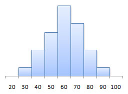
Later, in Section 7.1, we defined a normally distributed random variable to be one whose histogram follows the normal (bell-shaped) curve:
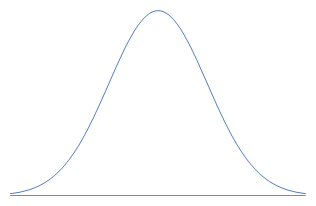
So if we have the histogram, we can determine whether or not the random variable follows the normal distribution.
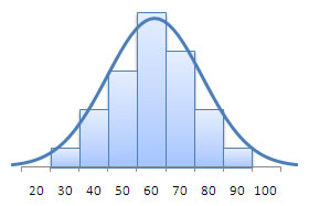
What happens, though, when the sample size is so small that we can't really see the distribution shape in the histogram? We need another method, which brings us to the topic for this section.
The Normal Probability Plot
A normal probability plot is a graph that plots the observed data versus the normal score, which is what we would expect if the data actually followed the standard normal distribution.
In other words, if we have 15 observations, the 10th normal score would be the expected 10th value if the data followed the standard normal distribution.
We know from earlier this section that
| Z = | x - μ |
| σ |
If we solve this equation for X, we get X = μ + σZ, which is the equation for a line. This gets us to the key result:
If sample data are taken from a population that is normally distributed, a normal probability plot should be approximately linear.
Constructing a Normal Probability Plot Using Technology
Unfortunately, StatCrunch doesn't have a method of producing this plot, so we'll instead be doing a Q-Q plot, which is different but offers similar results. Q-Q Plots in StatCrunch
|
| You can also go to the video page for links to see videos in either Quicktime or iPod format. |
Example 1
Suppose we wish to know whether the resting heart rates of a sample of Mth120 students are normally distributed.
| heart rate | ||||
| 61 | 63 | 64 | 65 | 65 |
| 67 | 71 | 72 | 73 | 74 |
| 75 | 77 | 79 | 80 | 81 |
| 82 | 83 | 83 | 84 | 85 |
| 86 | 86 | 89 | 95 | 95 |
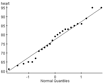
Based on this plot, it does appear as though the resting heart rates are approximately normally distributed. The plot is fairly linear, with just a couple points straying from the line.
Example 2
Suppose we wish to know whether the number of children that students in a particular Mth120 class have in their family is normally distributed.
| number of children | ||||
| 3 | 4 | 3 | 1 | 5 |
| 3 | 2 | 4 | 2 | 5 |
| 9 | 2 | 3 | 2 | 7 |
| 3 | 1 | 2 | 6 | 2 |
| 4 | 3 | 1 | 2 | 2 |
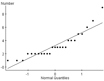
This plot is clearly not linear, so the data do not come from a normally distributed population.
